College magazine preliminary task Music magazine final product

In September I was given my preliminary task which was to create the front cover of a college magazine. The task was a way to practice and prepare for my main AS Media project and it allowed me to get a good idea of what to expect and to help plan ahead. The terminology used when making a magazine was all very new to me, such as the conventions like the mast head and plugs, so the preliminary task helped me learn these terms and improve my knowledge. I also learnt a lot more about the research process as I was unaware of how many different forms of research can be collected. The research I did for this task included a mood board, creating drafts and also reviewing existing products.


Feedback on my final product
I created a survey on Fluidsurveys.com and sent it to everyone in my class asking if they would complete it. The aim of the survey was to see if my product meets the areas I intended it to. I asked questions such as "What age range do you think my magazine is aimed towards?" so i could test whether I have met my target audience which was teenage girls aged 12-16. I have also combined some of the answers to the open questions for my survey, the feedback all seems to state that my pages are conventional and what areas are most noticeable.
Comparison of my products
I have used a much wider range of convention on my music magazine as oppose to my college magazine. My preliminary task only had the following conventions:

Music magazine task
When it came to starting my actual project I was a able to widen the amount of research methods I used. I completed a genre research for my music magazine so that i had a basic idea of what my chosen genre was about. I also looked at the conventions of existing product so I could get an idea of the general layout used, and I researched what songs were currently in the charts so that i could relate to them in my product. I believe that my research was successfully done so i could create my product for my selected target audience, one of the reasons is because of the survey results I received when my product was complete.


Feedback on my final product
I created a survey on Fluidsurveys.com and sent it to everyone in my class asking if they would complete it. The aim of the survey was to see if my product meets the areas I intended it to. I asked questions such as "What age range do you think my magazine is aimed towards?" so i could test whether I have met my target audience which was teenage girls aged 12-16. I have also combined some of the answers to the open questions for my survey, the feedback all seems to state that my pages are conventional and what areas are most noticeable.

Comparison of my products
I have used a much wider range of convention on my music magazine as oppose to my college magazine. My preliminary task only had the following conventions:
- Masthead
- Plug
- Barcode
- Features
My music magazine however has a much better range of conventions:
- Masthead
- Plug
- Barcode
- Features
- Main feature
- Skyline
- Footer
- Drop quote

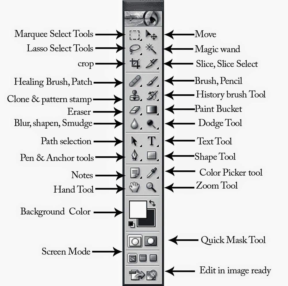
Overall I think i have made many improvments from when i made my preliminary task at the start of the year compared to my final music magazine product. I learnt a lot more about what a conventioanl magazine looks like and also how to make my own look as professional as possible. I developed many skills on photoshop which was one of the key aspects when creating the magazine. it was also very interesting to make a contents and article page as well, considering this was not part of the preliminary task. The research I did was a huge improvment compared to what I did for my college magazine, and analysing existing products of the same genre that i selected was a huge help when it came to developing my final product.


